DVB201 Typographic Design A2 - Sarah Wells n11300833
Research


This zine, Bodies of Water, created by Peter Calderwood and Lena Gustafson is an exploration of a series of cyanotypes. The zine features flowing ink drawings that are inspired by deconstructed photographs utilising the one colour to demonstrate how water shapes our mental and material landscapes. The two authors have used alternative print processes to create different type of imagery to evoke different feelings using only the one colour.
What I find interesting about this zine and inspiring in relation to my zine is the use of one singular colour to construct the whole zine. Though they have used different shades of the one colour, they have constructed images and feelings using only the one colours throughout all pages. As my zine project will be limited to two colours, I find it interesting the ways they have manipulated light and dark to create different variations and emotions for different images.


Close Encounters by Hannah K. Lee explores simple ideas which inspire the creation of her zines. This particular zine explores a combination of type and imagery to bring the zine to life. It demonstrates very simple and concise imagery with a clean integration of type into the images. Lee explores the human relationships with illustrations of the interactions of objects and colours.
The way Lee utilises almost a very minimalist design allows a great focus on the objects and words she is showcasing. In this way, Lee allows a lot of room for viewers top interpret what they are seeing themselves instead of overloading information instructing the viewers on what they should be interpreting.


Discovering a Person Through Graphic Design is a zine produced by Federico Agnelli. The project contains different graphic design projects that tell the dreams and emotions of a girl. I found this zine really appealing due to the more unpredicted layout of typography that is still represented in a clean and sophisticated mannerism. The placement of text across the page in different grids across the double page creates a lot of interest as opposed to a simple block of text. Additionally, the use of only black and white is quite powerful in this zine demonstrating how colour is not a necessary component to create interest and variation in layouts. The way Agnelli has used text to fill full pages is quite enticing.
Design Concepts
For this zine I am going to be focussing on the typeface Hiragino Sans. This zine will be exploring all aspects related to the typeface Hiragino Sans including its origination, design concept, features, and much more. I have always appreciated accessible fonts that are simple and legible and designed around their accessibility. This font encapsulates these design concepts whilst having a very original design to it. I have chosen to focus on this typeface as it has not received much attention in current times though it is very well recognised amongst Japan – where it originated from.
Based on my research and findings, I will be constructing a cohesive and balanced zine to display the typeface. I will utilise the typeface to create different variations across the zine that may be different to more conventional and traditional uses of typefaces. From conducting my research, I noticed that it was effective to utilise negative space to allow for the content in the zine to be even more effective and stand out. Additionally, I will be manipulating the colours I choose to create even more variations in combination with utilising the typeface in different manners.
Below I have included a layout of the zine and thumbnails depicting what I plan to have on each page.
Thumbnails and sketches


Final layout:
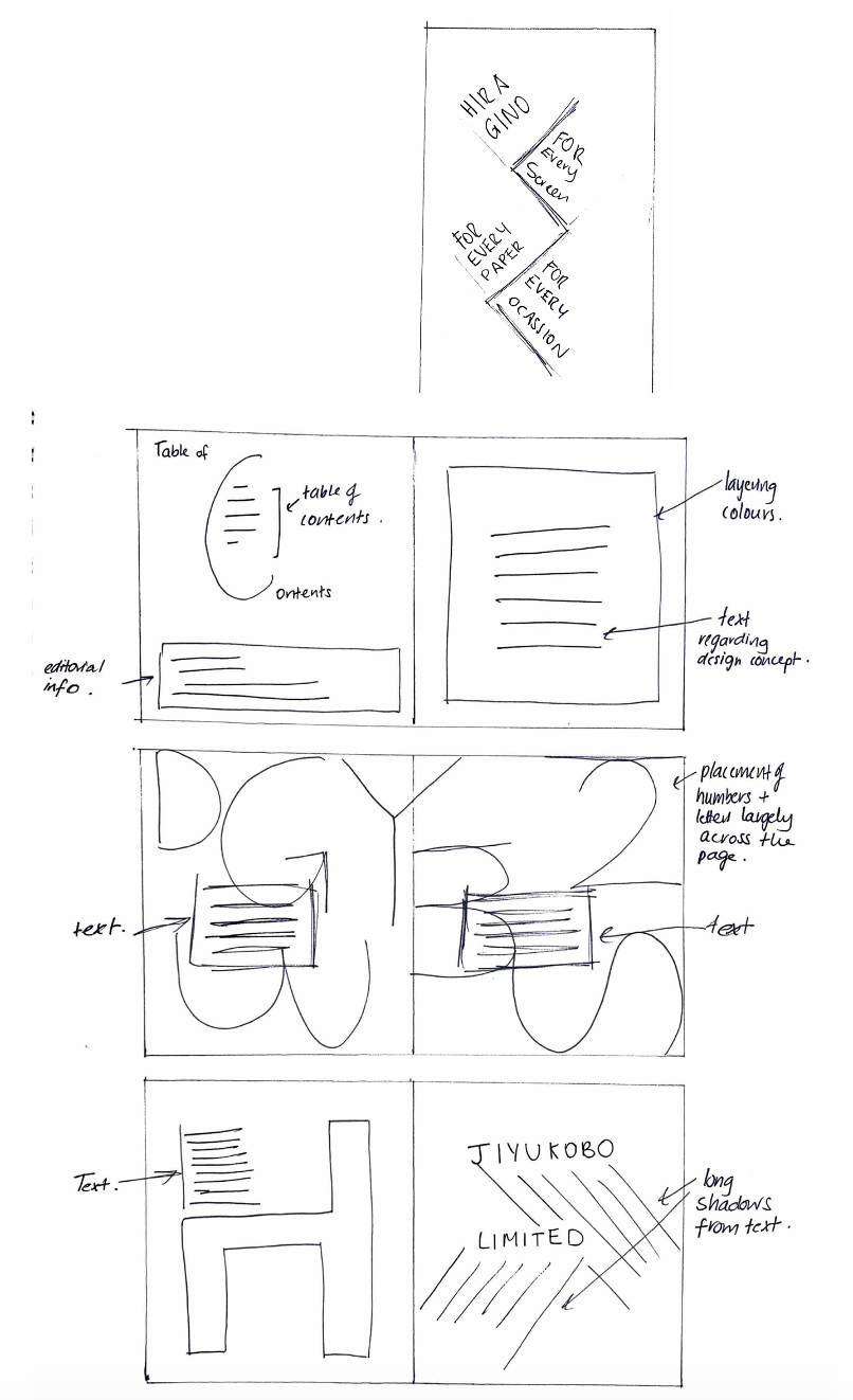
Page 1: Front cover
Page 2: Editorial and contents page
Pages 3-6: Feature article about Hiragino Sans
Pages 7-10: Profile on Designers of Hiragino Sans
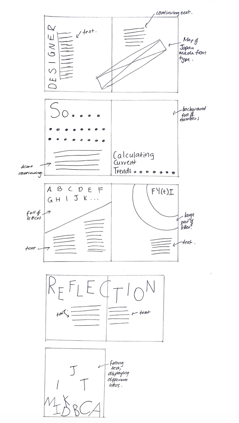
Pages 11-12: Type Trend related to Hiragino
Page 13: FY(t)I
Page 14-15: Reflection about this zine
Page 16: Back Cover
Written Content:
Page 1: Front Cover
Hiragino
For every screen
For every paper
For every occasion
Page 2: Editorial information and table of content
1 About
5 Designer
9 Trends
11 FYTI
12 Reflection
DVB201 Typographic Design
Sarah Wells n11300833
2023
References:
Adobe. (2023). Hiragino Kaku Gothic ProN.
https://fonts.adobe.com/fonts/hiragino-kaku-gothic-pron#fonts-section
Bassett, J. B. (2015). Inside Hiragino: A closeup of Apple’s macOS Japanese font.
https://atadistance.net/2015/11/02/inside-hiragino-a-closeup-of-apples-os-x-japanese-font/
Rimmer, K. (2023). 10 dynamic font trends for 2023: from street art typography to functional serifs.
https://www.envato.com/blog/font-trends/
SCREEN Graphic Solutions Co., Ltd. (2016). Hiragino Fonts.
https://www.screen-hiragino.com/#page-home
Page 3: Design concept and reasoning
Whilst being the font for Japan’s best selling smartphone, Hiragino has found itself in differing occasions. The font was designed for versatility and use across different displays especially with readability as the main design concept. The font was developed for maximum impact in a digital environment where it now finds itself used for car navigation systems, consumer electronics, software, advertising and corporate materials. Additionally, this particular typeface includes 29,064 simplified Chinese characters in its vocabulary. This typeface embraces a unified design concept for Japanese, Chinese, and European characters including a variety of symbols and punctuation marks. Not only is this typeface designed for digital practise, but also was designed for printing purposes where the clean edges would not smudge or blur when printed on paper accounting for more traditional users. The goal was to create a font that catered for contemporary needs.
Page 4: Features
Hiragino is the face of simplicity. A composition of clean lines that forms a spacious typeface allows for a strong visual presence in all forms. The attention to detail is notably this typeface’s greatest achievement with a finely balanced framework that contributes to the ease of its visual appeal. All characters across all languages are focused around their natural centre of balance utilising a balance of the white space backing the character for uniformity as well. Consequently, this allows Hiragino to appear visually seamless in many print variations. As well as this, it allows for readability across all sizes of the text as characters stay sharp and clear even at minimal sizes. Ultimately, this typeface truly does embody the universal concepts of design appealing to all viewers in a simplistic and calming manner.
Page 5: Process
The designers wanted to create a font that had originality to compete with competitors and one that particularly was not flashy or trendy, something that would work in the long run. They worked with Adobe GB 1-4 character set (29,064 glyphs) at 2 weights. One year was given for the entire project (6 months for each weight). The designed were handed off to font engineers who did the 2-byte roll up and encoding.
Page 6: Reflection and critique
This typeface is well balanced using the true centre of each character making it a very easily readable and overall balanced typeface. Though the typeface is a simple sans serif style, it has a particular originality to it through the different aspects such as a larger size of counters and the attention to caps. Though this type face contains 10 weights, it could have included more variations such as a bold and italic variations that provides more clarity when the font is bolded or italicised.
Page 7: Creator of Hiragino
Jiyukobo Limited the creator of Hiragino
Page 8: About the designers
Designer
Hiragino was designed by Jiyukobo Limited. Jiyukobo Limited was founded by three creators: Osamu Torinoumi, Tsutomu Suzuki, and Keiichi Katada. These three designers started at a company named Sha-Ken where fonts were not produced digitally. The company would output the outlines onto photographic paper then make adjustments to each glyph individually by hand. Though this produced high-quality results, it was inneficient and these three designers thought they could try a better way.
Page 9: About the designers continued
Suzuki dreamt of designing fonts for a living which at this time was laughable unfortunately. Torinoumi dreamt of designing a mew mincho typeface. Suzuki and Torinoumi begun working together and invited Katada to join and the business begun.
Page 10:
So….
………
………
………
………
………
One of their first projects was for Canon, who requested a typeface design for Kana. Then, they received another project requested from DaiNippon Screen in 1990. After struggling to balance design and business plans – as none of these designers were businessmen – they decided they wanted to create one Mincho and one Gothic typeface. Consequently, this is what led to the creation of Hiragino.
Page 11: Current trend
Calculating Current trends………..
Page 12: Current trend in relation to Hiragino
Accessibility. Accessibility has arguably always been a trend and always should be a trend. Clear lettering and easy-to-read type sizes are necessary for today’s society. A clear sans serif font that tends to aid comprehension and can support many different languages is what we need in our progressive times. Between our advances in technology and use of more traditional forms of communication, we need a typeface that is going to be able to be transferred across all different platforms in different situations and accessible to the whole world. Hiragino does just this.
For the design industry, this means we should be expecting accessible fonts to come in the future. This does not necessarily mean an array of fonts that all look the same with small variations. This still allows room for experimentation and illustrative type design that will be structured around a more accessible design concept.
Page 13: Fy(T)I
FYTI, let’s talk about counters
Hiragino has counters that are comfortably wide in comparison to other typefaces. In having wider counters, this allows for a greater amount of whitespace present in the typeface overall. Consequently, a greater amount of whitespace allows readers to distinguish the letters in an easier manner increasing the readability of the typeface.
Page 14: Reflection
The most important aspect of creating this zine was playing with different compositions and positioning of letters. Without experimentation of how different letters and overlap with each other, size of letters, utilising shaping of letters, I would not have been able to create such visually differing layouts as I did. This could only come from using letters in an unexpected manner as opposed to a more traditional manner. One of the most important aspects as well was the use of hierarchy and how this could be manipulated in order to achieve different layouts whilst still creating a very readable zine. The constriction of using only 2 colours as well as the page colour proved to be quite an effective method to keep the zine consistent and forced me to use different methods to create interest and difference between the pages instead of using colour to create interest. Additionally, not only was it a challenge but it also kept the zine very clean and consistent without too much visual noise to comprehend especially with the amount of text apparent.
Page 15: Reflection continued
As an area of improvement, I believe I could have looked more into how I could utilise different grid structures to create a more balanced and cohesive look across the different pages. As I used many different grids on individual pages it appears to be less cohesive. Though the overall process required a lot of trial and error, the process was actually very entertaining and interesting to see what different appearances could be created with using typefaces – something I do not as commonly utilise in other design challenges.
Page 16: Back cover
First Draft


After creating the first draft, I could begin to visualise the zine and see what points needed change to enhance the cohesiveness of the overall project. For example, I could see that I could manipulate page three more to create a more visually interesting page. Additionally, I struggled to create a space for the text in pages 4 and 5 consequently some re-arrangement needs to happen in order for the page to be more legible. Overall, I was satisfied with the colours I had chosen and the overall design process so far.
Final Design


Mockups


Design Decisions
Colour
I decided to go with 2 slightly darker colours for a more sophisticated and clean look whilst also having a very toned down vibrancy in the red colour. I chose plain white as the main background colour for a simple and balanced contrast to mix with the two darker colours chosen. Overall, I believe the colours I chose worked well with each other to compliment different design variations and catch the eye whilst also still remaining balanced and sophisticated. The usage of the white space particularly helps draw the eye and create a focal point within the design causing selected elements to stand out (Marq, 2023).
Hiragino has different weights which I utilised to establish hierarchy within each layout. I utilised contrasting weights side by side to create a visual hierarchy and show order of importance for information. Additionally, I also utilised hierarchy to make particularly elements standout from within other components. Hierarchy is imperative as the human brain has an innate desire to organise individual elements, shapes, or forms into a coherent whole meaning that elements that disconnect from the whole standout to the reader (Marq, 2023).
Reflection
The most important aspect of creating this zine was playing with different compositions and positioning of letters. Without experimentation of how different letters and overlap with each other, size of letters, utilising shaping of letters, I would not have been able to create such visually differing layouts as I did. This could only come from using letters in an unexpected manner as opposed to a more traditional manner. One of the most important aspects as well was the use of hierarchy and how this could be manipulated in order to achieve different layouts whilst still creating a very readable zine. The constriction of using only 2 colours as well as the page colour proved to be quite an effective method to keep the zine consistent and forced me to use different methods to create interest and difference between the pages instead of using colour to create interest. Additionally, not only was it a challenge but it also kept the zine very clean and consistent without too much visual noise to comprehend especially with the amount of text apparent.
As an area of improvement, I believe I could have looked more into how I could utilise different grid structures to create a more balanced and cohesive look across the different pages. As I used many different grids on individual pages it appears to be less cohesive. Though the overall process required a lot of trial and error, the process was actually very entertaining and interesting to see what different appearances could be created with using typefaces – something I do not as commonly utilise in other design challenges.
References
Adobe. (2023). Read these 10 unmissable zines to get through 2021.
https://creativecloud.adobe.com/cc/discover/article/read-these-10-unmissable-zines-to-get-through-2021?locale=en
Adobe. (2023). Hiragino Kaku Gothic ProN.
https://fonts.adobe.com/fonts/hiragino-kaku-gothic-pron#fonts-section
Agnelli, F. (2022). Raccontare e scoprire una persona attraverso il graphic design.
Bassett, J. B. (2015). Inside Hiragino: A closeup of Apple’s macOS Japanese font.
https://atadistance.net/2015/11/02/inside-hiragino-a-closeup-of-apples-os-x-japanese-font/
Marq. (2023). 6 essential elements of graphic design posters.
https://www.marq.com/blog/6-essential-elements-graphic-design-poster
Rimmer, K. (2023). 10 dynamic font trends for 2023: from street art typography to functional serifs.
https://www.envato.com/blog/font-trends/
SCREEN Graphic Solutions Co., Ltd. (2016). Hiragino Fonts.
https://www.screen-hiragino.com/#page-home
